Friday, May 30, 2008

Supermarket Tile

A reader provided some history in the comments on the post about the market at 31st and Judah.

One of the things I love about old storefronts is the tile. And this one has a lot of it.


This vent cover is really neat.


And there is quite a variation in them around the neighborhood.


The bumped out header, for lack of a better term is kind of unique.


I just noticed the other day that the same red tile is on the residential/commercial building next door.
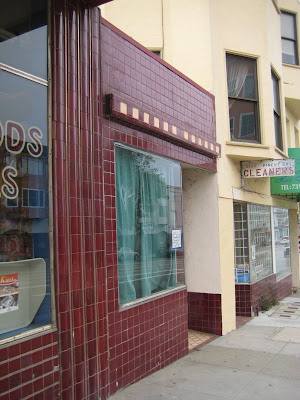

Here is the entryway for the residential/commercial:


And the little storefront:

Wednesday, May 28, 2008

Mystery Building

I've ridden by this building a million times on the "N" and wonder what it is. It is on Judah at 32nd Avenue.
That sign is illegible. The City records show it is an RH-2 two unit, one story building, with two bathrooms and no baths, built in 1948. Hmmm. However the mailing address is 25 Van Ness Avenue, which is City government offices.

Any ideas?

(Edited June 14th, 2008: This is simply a substation.)

Tuesday, May 27, 2008

Concerte Contractors

A few weeks ago I realized I was wrong about the location of this concrete imprint. You will also remember I was lamenting the fact that they aren't as plentiful as I remembered.

Well, I hit the jackpot on the 1400 block of 33rd Avenue. I found both the location of my mis-labeled mark and quite a few others.

On the west side of the street I found these two "?. SARTORIO 1938 S.F.". Or is the second one 1920-something? I can't tell.

Also on the west side were are at least two "D.C. McCABE & SON CONTRACTORS"

Over on the east side of the block D.C. McCabe or his son went a little crazy:


This is the only one I've seen imprinted at an angle:

Sunday, May 25, 2008

That '70's Building

Here's another building I recall bugging me as a kid. It's at 25th and Irving and built in 1978, according to City records. Back then I think I found it vaguely dark and scary. I don't think the shingles were originally a light color.

Today I can verbalize my dislikes. Of course the usual 1970's complaints: black aluminum window frames, brown bricks, etc. But these arches are the main thing. I don't understand them, they seem really out of scale with the top of the building. All these curves just don't gel with the rectangles up above.


Two tones of brown bricks! The entry has huge tiles on either side of the door, and yellowish brown light fixtures.

I've seen this attempt at dentil on a few 1970's building around. It just doesn't work on a contemporary building, in my opinion. Especially one that is not trying to be anything but contemporary with the big brick arches below.